
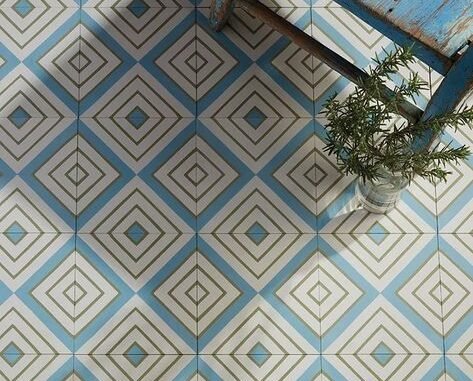
Statement Tile Ideas
Some rooms whisper. Others walk in wearing a red dress. Statement tile is how you give a kitchen, bathroom, or entryway that main-character energy — one bold surface that does the talking so everything else can stay quiet. These statement tile ideas cover the looks designers are actually specifying for fall 2026: handmade zellige, earthy terracotta, moody dark bathrooms, graphic black-and-white floors, and clever budget ways to get the look without a full renovation.
The golden rule of statement tile is restraint everywhere else. Pick one surface to star — the backsplash or the floor, not both — and keep cabinetry, paint, and fixtures calm so the tile can shine. Ready to find your look? Here are twenty ideas, from timeless to trend-forward, with practical notes on cost, installation, and upkeep.
1. What Makes Tile a “Statement”
A statement tile earns its title through contrast: it is bolder, more colorful, more patterned, or more textured than everything around it. Think of it as the focal point of the room’s composition — the eye lands there first, then travels. Scale matters as much as pattern; an oversized hexagon in a quiet glaze can be just as commanding as a busy encaustic print. Color, shape, finish, and layout all contribute, and the strongest statements usually commit to just one or two of those at a time.
Placement is the other half of the equation. A statement tile works best where it gets uninterrupted sightlines: behind a range, across a shower wall, underfoot in a foyer. Confine it to a single plane and let adjacent surfaces recede in solid, quiet tones. That discipline is what separates a designed look from visual noise — and it is also what keeps the budget in check, since statement tile is priced to be used sparingly.

2. Zellige Tile Backsplashes
Zellige — handmade Moroccan tile with softly irregular surfaces and luminous glaze — remains the darling of statement tile ideas, and for good reason. Each tile varies slightly in tone and texture, so a whole wall shimmers with handmade character that flat, machine-made tile cannot imitate. In fall 2026, designers are leaning into earthy zellige shades: warm white, clay, sage, and deep sea green.
Use zellige as a full-height backsplash behind open shelving, where the variation catches the light. The handmade edges mean installation takes longer and grout lines stay slightly uneven — that is the point, so hire an installer experienced with artisan tile. Seal it well in wet zones, and order 15 percent overage since handmade lots vary. The result is a kitchen that feels collected and soulful rather than showroom-perfect.

3. Bold Patterned Floor Tile in the Entryway
The entryway is the ideal stage for a statement tile moment: it is small, so the cost stays manageable, and it sets the tone for the whole house. Patterned cement-look or encaustic-style floor tile — stars, Mediterranean motifs, bold geometrics — turns a plain foyer into a proper arrival. Because foyers take weather and foot traffic, choose porcelain versions of these patterns rather than true cement tile; you get the look with far better durability and stain resistance.
Lay the pattern wall to wall for maximum impact, or create a “rug” effect by bordering the patterned field with a solid tile frame. Keep walls and trim simple so the floor stays the star. In fall 2026, the freshest take pairs classic patterns with muted, earthy colorways — terracotta and cream, charcoal and bone — rather than high-contrast brights. Add a washable runner in winter to protect the finish from salt and grit.

4. Terracotta Tiles for Warm, Earthy Kitchens
Terracotta brings instant warmth — literally and visually. Its sun-baked orange and rust tones make white kitchens feel alive and give modern spaces an old-world soul. For fall 2026, terracotta is moving beyond floors to backsplashes and even range hoods, often in small handmade-look squares or elongated picket shapes that feel fresh rather than rustic.
Real terracotta is porous and needs sealing, so many homeowners choose porcelain terracotta-look tile for kitchens and baths — all the warmth, none of the maintenance anxiety. Pair it with creamy whites, unlacquered brass, and natural wood for a Mediterranean-inflected look, or with black accents for something moodier. Keep the layout simple; terracotta’s color variation is pattern enough. In open-plan homes, running it from kitchen into an adjoining mudroom creates beautiful continuity.

5. Marble Tile Fireplace Surrounds
The fireplace is a room’s natural focal point, so cladding it in statement tile is almost unfair — in the best way. Book-matched marble-look porcelain or real marble slabs with dramatic veining turn a plain firebox into sculpture. For fall 2026, designers are taking tile all the way to the ceiling on fireplace walls, sometimes wrapping the chimney breast for a monolithic, architectural effect.
Large-format tiles minimize grout lines and maximize the drama of the veining, but they demand perfectly flat substrate and an experienced installer. If real marble’s maintenance gives you pause, high-definition porcelain captures the veining convincingly and shrugs off soot and heat. Style the mantel minimally — a single piece of art or a sculptural object — so the stone stays the headline. This is a splurge surface; keep the rest of the room quiet and let it carry the design.

6. Checkerboard Floors, Reimagined
Checkerboard is back, but not the red-and-white diner version. The 2026 take is oversized squares in unexpected color pairings — forest green and cream, charcoal and warm white, even terracotta and bone. Bigger tiles (12 inches and up) make the pattern feel modern and calm rather than busy, and laying them on the diagonal adds energy to long hallways and kitchens.
Porcelain or natural stone both work; marble checkerboard is the classic luxury move, while porcelain keeps it practical for mudrooms and kitchens. The key to a fresh checkerboard is restraint elsewhere: solid cabinetry, simple walls, minimal pattern competition. It is a forgiving DIY-friendly layout too, since the grid is straightforward to plan — just dry-lay first to center the pattern and avoid sliver cuts at the edges.

7. Dramatic Dark Tiles in Bathrooms
Moody bathrooms are having a moment, and dark statement tile is how you get there. Deep charcoal, ink navy, or near-black tile on every wall turns an ordinary bathroom into a cocoon — especially effective in windowless baths where light tile can feel flat and clinical. The trick is finish: glossy dark tile bounces light around and keeps the room from feeling like a cave, while matte reads more modern and restful.
Balance the darkness with warm metals (brass or bronze fixtures), a light vanity top or wood vanity, and generous mirror. Good lighting is non-negotiable — layer sconces with overhead light on dimmers. Dark grout hides discoloration and keeps the look seamless. This is one of the boldest statement tile ideas on the list, so commit fully; a half-dark bathroom just looks unfinished. In a small bath, try dark tile on the shower walls only.

8. Hand-Painted Talavera and Portuguese Azulejos
Few tiles carry as much joy as hand-painted Talavera from Mexico or azulejos from Portugal — cobalt blues, sunny yellows, and intricate folk patterns that feel like art you can walk on. Use them as a stair riser detail, a kitchen backsplash, or a framed “rug” inset in a patio floor. Their charm is in the imperfection: no two tiles match exactly, and the look should feel collected over time rather than installed in a day.
Because these are traditional ceramic tiles, they are best in low-moisture or vertical applications unless properly sealed; for shower floors, look to porcelain reproductions. Mix patterns within the same color family for an authentic collected feel, or choose a single repeating motif for something calmer. Pair with whitewashed walls and natural textures — wood, rattan, linen — and let the tile supply all the color the room needs.

9. Oversized Format Tiles for Modern Drama
When the tile itself is enormous — 24×48 inches and beyond — the material becomes the statement. Huge slabs of marble-look or concrete-look porcelain with minimal grout lines create seamless, gallery-like surfaces that make small rooms feel larger and large rooms feel architectural. This is the minimalist’s statement tile: drama through scale and material honesty rather than pattern.
Large-format tile demands expert installation: the substrate must be perfectly flat, and the tiles are heavy and unforgiving. Use a leveling system and expect higher labor costs — the material savings in fewer grout lines are offset by the skill required. Keep the palette restrained: one stone look, carried across floor and one wall, reads as luxury. In fall 2026, warm-toned stones — travertine and warm gray marble looks — are edging out the cooler grays of years past.

10. Mosaic Tile Accent Walls
Mosaics — small tiles mounted on mesh sheets — let you create texture and gradient effects that large tile cannot. A full wall of small-format mosaic in a single color family, like sea-glass greens or warm neutrals, reads as rich texture from across the room and intricate detail up close. Penny rounds, mini hexagons, and stacked finger mosaics are the shapes designers reach for most.
Use mosaics where you want touchable texture: shower walls, behind a floating vanity, or as a kitchen backsplash. They are naturally slip-resistant on floors thanks to all the grout lines, making penny rounds a smart shower-floor pick. The labor is higher per square foot than large tile, so confine mosaics to accent areas. Choose a grout color close to the tile for a seamless watercolor effect, or contrasting grout to make the pattern pop.

11. Green Tiles: The Color of the Moment
If one color defines statement tile in 2026, it is green — from deep emerald to soft sage. Green tile feels both fresh and timeless: it nods to nature, flatters wood tones, and works in traditional and modern rooms alike. An emerald subway tile backsplash with brass hardware is the current classic, while sage zellige in a bathroom reads calm and spa-like.
The shade you choose sets the mood. Dark greens are dramatic and pair beautifully with marble and brass; mid-tone greens feel organic with oak and cream; pale sages are nearly neutral and suit whole-wall applications. Test large samples in your actual light before committing — green shifts dramatically between warm and cool bulbs. And because green is trending, choose a handmade or textured tile so the look reads as crafted rather than fashionable.

12. Statement Tile in the Shower
The shower is a self-contained stage made for a statement. Tiling all shower walls floor-to-ceiling in a single bold tile — a deep green, a handmade-look ceramic, a dramatic stone — creates an immersive, spa-like moment every morning. Because the area is compact, you can afford a pricier tile here than you might use across a whole bathroom floor.
Design details elevate it: a tiled niche with contrasting tile inside, a bench clad in the same material, or a feature wall behind the showerhead in a different pattern. Keep the glass frameless so nothing interrupts the tile, and choose slip-rated tile for the shower floor — often a smaller mosaic version of the wall tile. Good waterproofing behind the tile matters more than the tile itself, so invest in the membrane system, not just the pretty surface.

13. Outdoor Statement Tile
Statement tile is not just for interiors. Patterned tile on a patio, a tiled plunge-pool surround, or a bold outdoor kitchen backsplash extends your design outdoors — and outdoor-rated porcelain handles freeze-thaw cycles and sun far better than the materials of the past. Mediterranean and Moroccan patterns feel natural outside, echoing the courtyards they came from.
Use slip-resistant, frost-proof porcelain rated for exterior use, and choose patterns that hide a little dirt — busy motifs are forgiving. A classic move is tiling stair risers with patterned tile while keeping treads solid stone: all the charm, none of the slip worry. In fall 2026, outdoor kitchens are still booming, and a statement tile backsplash behind the grill is the fastest way to make one feel designed rather than assembled.

14. Mixing Tile Shapes: Hexagons, Arabesque, and Fish Scale
Shape is an underused statement tool. Hexagons, arabesque lanterns, pickets, and fish scale (mermaid) tiles create pattern through geometry alone — no printed design needed. A wall of fish scale tile in a glossy glaze reads as both modern and romantic, while elongated hexagons give a contemporary edge to classic subway layouts.
The key to mixing shapes is committing to one shape per surface; two competing geometries in one sightline get chaotic fast. Fish scale and arabesque shapes suit bathrooms and backsplashes where their curves catch light beautifully. Hexagons work on floors — the shape hides grout lines well and the honeycomb pattern is forgiving of imperfect layouts. Order extra for cuts: shaped tiles generate more waste than squares, so plan on 15 to 20 percent overage.

15. Black and White Graphic Tile
Black and white never leaves, it just changes costume. Beyond checkerboard, graphic black-and-white tile — art deco fans, bold geometrics, high-contrast florals — delivers timeless drama that works in any era of home. It is the tuxedo of statement tile ideas: appropriate everywhere, boring nowhere.
The classic applications are bathroom floors and kitchen backsplashes, where the graphic punch is contained and easy to live with. Keep everything else in the room quiet — white walls, simple fixtures — and let the tile be the single exclamation point. For a softer take, choose patterns with a handmade feel or slightly irregular edges rather than razor-sharp geometrics. Black grout with white tile (or the reverse) intensifies the graphic effect; matching grout softens it.

16. Tile-Clad Kitchen Islands
The kitchen island is prime statement real estate that most people leave blank. Cladding the island’s sides — or wrapping it in a full waterfall of the same tile as the backsplash — creates a furniture-like focal point in the middle of the room. Handmade-look tile on an island base pairs beautifully with a simple stone countertop above it.
This works best on islands with clean, flat sides; heavily paneled island bases fight with tile. Protect the lower edges with a slim metal trim, since island bases take kicks and bumps. Because the island is viewed from all sides, choose a tile that looks good in repetition and keep the pattern scale proportional to the island’s size — small mosaics can look busy on a big island, while large-format tile can overwhelm a small one.

17. Statement Tile in Small Powder Rooms
Designers call the powder room the jewel box — a tiny space where you can take big risks because you only experience it for minutes at a time. It is the perfect laboratory for your boldest statement tile ideas: a wild pattern, a saturated color, floor-to-ceiling drama. Guests remember a daring powder room long after they forget the living room.
Go all in: bold tile on walls and floor, a sculptural mirror, dramatic lighting. Small spaces can handle maximalism because there is so little of them. Since powder rooms have no shower, you can use delicate materials — real cement tile, hand-painted ceramic — that would struggle in a full bath. Keep the vanity floating or minimal so the tile stays visible, and do not skimp on lighting; a jewel box needs its spotlight.

18. Budget-Friendly Ways to Get the Look
Statement tile does not require a statement budget. Peel-and-stick tile has matured dramatically — the best versions convincingly mimic zellige, terracotta, and patterned cement tile, install in a weekend, and suit renters since they remove cleanly. They are ideal for backsplashes and low-moisture areas, though not for shower floors or high-heat zones behind a range.
Other budget moves: tile paint can transform dated ceramic for a fraction of replacement cost (use tile-specific paint and seal it); tiling just a small area — a niche, a backsplash, a fireplace surround — delivers the statement at a fraction of whole-room cost; and shopping clearance lots or overstock sites can score designer tile at 50 percent off if you are flexible on exact shade. The statement is in the boldness of the choice, not the price of the tile.

19. Grout as a Design Tool
Grout is the quiet partner that can make or break a statement tile. Contrasting grout — dark grout with white tile, white grout with dark tile — outlines every tile and turns the grout lines into part of the pattern, amplifying graphic and geometric looks. Matching grout, by contrast, lets the tile’s color and texture read as one continuous surface, which suits handmade tile like zellige where you want the glaze variation to shine.
Grout width matters too: tight joints feel modern and seamless, while wider joints lean rustic and handmade. For statement tile, epoxy grout is worth the upgrade in kitchens and baths — it resists staining far better than cement grout, keeping bold patterns crisp for years. Whatever you choose, seal cement grout annually in wet areas, and remember that grout color looks darker when wet, so judge samples dry.

20. Care and Maintenance for Statement Tile
A statement tile should stay a statement, not become a maintenance saga. Porcelain — including porcelain that mimics zellige, marble, and cement tile — is the lowest-maintenance choice: it resists stains, needs no sealing, and cleans with mild detergent. Natural stone and real cement tile are more demanding, requiring sealing at installation and resealing every year or two, plus pH-neutral cleaners only.
Handmade-look tiles with crackle glazes can craze further over time — that is part of their charm, but know it going in. In showers, squeegee glass and tile after use to prevent hard-water buildup on dark tiles, where spots show most. Keep a box of spare tiles from your installation; dye lots change and a future repair without matching tile is a headache. Choose the maintenance level you will actually sustain — the best statement tile is the one that still looks intentional in five years.

Statement tile is ultimately about confidence — choosing one surface to be brave and letting it transform the room around it. Whether you go for handmade zellige, earthy terracotta, moody dark walls, or a graphic black-and-white floor, the formula is the same: one star, a quiet supporting cast, and installation done right. Start with the room you use most, pick the idea that made you stop scrolling, and give your home its main-character moment this fall.
Leave a Reply